


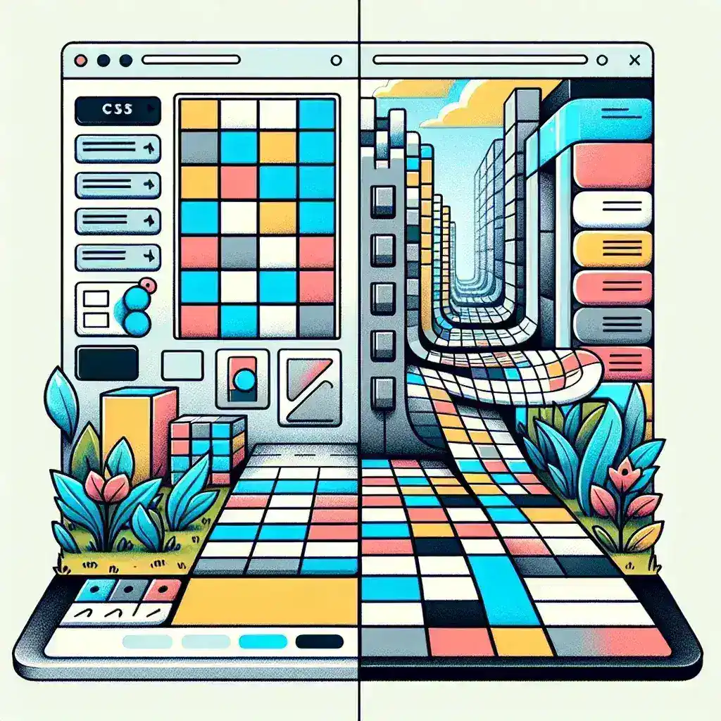
CSS Grid and Flexbox are two of the most powerful layout tools available in modern web design. Both offer unique capabilities that can significantly enhance the responsiveness and flexibility of your web layouts. In this comprehensive guide, we will delve into the key features of CSS Grid and Flexbox, and provide clear guidance on when to use each.
Understanding CSS Grid
CSS Grid is a two-dimensional layout system that allows you to create complex and flexible layouts with ease. It provides a grid-based approach to web design, enabling you to control the placement of elements in both rows and columns. This makes it ideal for creating layouts that require a more structured and precise arrangement of elements.
Key Features of CSS Grid
- Two-dimensional Layout: Grid allows you to define both rows and columns, making it perfect for creating complex layouts with multiple elements.
- Responsive Design: Grid layouts can be easily made responsive using media queries and the
frunit, which allows for flexible and fluid elements. - Alignment and Sizing: Grid provides powerful alignment and sizing controls, enabling you to precisely position and size elements within the grid.
- Named Lines and Areas: You can name grid lines and areas, making it easier to place elements and maintain a clean and readable codebase.
When to Use CSS Grid
CSS Grid is best suited for layouts that require a grid-like structure. Here are some scenarios where Grid shines:
- Complex Layouts: If your design involves multiple elements that need to be precisely placed in a grid-like structure, Grid is the way to go.
- Responsive Design: Grid’s ability to create flexible and fluid layouts makes it ideal for responsive design, especially when combined with media queries.
- Masonry Layouts: Grid can be used to create masonry layouts where elements can vary in size but still align properly.
- Dashboard and Panel Layouts: Grid is perfect for creating dashboard and panel layouts where elements need to be organized in a structured manner.
Understanding Flexbox
Flexbox, or Flexible Box Layout, is a one-dimensional layout system that provides a more flexible way to align and distribute space among items in a container. It is particularly useful for creating flexible and dynamic layouts that adapt to different screen sizes and content lengths.
Key Features of Flexbox
- One-dimensional Layout: Flexbox is primarily designed to work in one dimension, either in rows or columns. This makes it ideal for simpler layouts where items need to be aligned in a single direction.
- Flexible Sizing: Flexbox allows items to grow or shrink to fill available space, making it perfect for creating flexible and responsive layouts.
- Alignment and Distribution: Flexbox provides powerful alignment and distribution controls, enabling you to align items within a container and distribute space effectively.
- Ordering: You can change the order of items within a flex container, which is useful for rearranging elements without changing the HTML structure.
When to Use Flexbox
Flexbox is best suited for simpler layouts that require flexible and dynamic alignment. Here are some scenarios where Flexbox is the better choice:
- Simple Navigation Bars: Flexbox is ideal for creating simple navigation bars where items need to be aligned and distributed evenly.
- Centering Elements: Flexbox makes it easy to center elements both horizontally and vertically within a container.
- Equal Height Columns: Flexbox can be used to create columns that have equal height, even if the content within each column varies in size.
- Responsive Design: Flexbox is great for creating responsive layouts that adapt to different screen sizes and content lengths.
Comparing CSS Grid and Flexbox
While both CSS Grid and Flexbox are powerful layout tools, they serve different purposes and are best suited for different scenarios. Here is a comparison to help you decide which one to use:
| Aspect | CSS Grid | Flexbox |
|---|---|---|
| Layout Dimension | Two-dimensional (rows and columns) | One-dimensional (rows or columns) |
| Complexity | More complex, suitable for complex layouts | Simpler, suitable for simpler layouts |
| Flexibility | Highly flexible, with precise control over alignment and sizing | Highly flexible, with dynamic alignment and distribution |
| Responsive Design | Excellent, with the fr unit and media queries |
Excellent, with flexible sizing and reordering |
| Use Cases | Complex layouts, dashboard designs, masonry layouts | Simple navigation bars, centering elements, equal height columns |
Conclusion
Both CSS Grid and Flexbox are essential tools in a web developer’s toolkit. The choice between the two depends on the specific requirements of your layout. CSS Grid is ideal for complex, grid-like structures, while Flexbox is better suited for simpler, one-dimensional layouts. By understanding the strengths and weaknesses of each, you can make informed decisions and create more efficient and responsive web designs.
Remember, the key to mastering these tools is practice and experimentation. Try out different layouts and see which tool works best for your needs. Happy coding!